Beautiful design, horrible UX. (I know, I know. Suddenly everyone on HN is a UX designer. But hear me out.)
I count eight distinct types of system font in there, all denoting different data/functionality. Semiotically there are no signifiers other than the size, weight and position of the text. It's the closest thing you can get to mystery meat navigation whilst still providing words.
Look at current incarnations of Windows Explorer that people are familiar with. There is a very clearly delineated sidebar and "address bar" at the top. (The web changed the way that people interact with computers. Many people's first and only experience with computer applications is a web browser, and unfortunately for many of them it will have been Internet Explorer.)
By removing the lines of demarkation between UI elements, instead of downgrading the system interface it's been upgraded. Everything in the Windows Explorer pane is on equal footing.
The out of focus windows would get old pretty quickly too. If you're working on two things side by side your eyes have to switch between one in-focus and one out-of-focus window. Unless there's a way to dynamically switch focus to "on" for multiple windows, but then that would get messy quite quickly when you can't tell whether something is in the background or foreground, active or inactive. Yuck.
The dock at the bottom looks nice, but the challenge is that you're reliant on icon designers adhering to very specific standards or the whole thing will look crazy.
You are right, Looking good and actually being usable are quite different.
The main problem with this concept, I think, was that the extreme minimalism ended up in a UI that hides too much information.
Even when I love the way it looks like, it feels like I would need to hover everything, just to get more info (and if Win8 aims to touch devices... hover is not good).
And of course, it doesn't look good for multitasking.
I think you're reading too much into your acquired knowledge.
I count two typefaces, at varying sizes & emphasis, according to their importance. The header hierarchy and sizing is quite nice actually.
Separating lines are not the only way to achieve grouping or separation, whitespace can be just as (usually more) effective. You can see in the Skype window that a slightly darker background helps isolate the action area and give focus to the chat area. The gestalt principles are also in effect here.
My main criticism would be the unnecessary whitespace at the top of the Explorer and Skype windows, which is also inconsistent with the browser window behind, and causes the window controls (max/min/close) to be too far from the edge and consequently less easy targets. In Skype it's even worse since they are shunned onto the middle of the window. That is an usability nightmare.
I agree with the out-of-focus effect. Maybe the effect could only apply to overlapping windows, if windows are not touching then both are in focus - that solves the multi-app workspace case. OSX uses very broad shadows to basically achieve the same.
Sorry, not typefaces: it was meant to be typefaces/different spins on typefaces.
Separating lines aren't the only way, but there isn't enough whitespace here to be good: it just looks like a regular Windows Explorer window without the lines; there's not a lot of increased space.
Really nice, though it begs the question; seeing as you can't meaningfully affect Windows 8's design without joining Microsoft on the relevant team(s), why not apply your design skills to the Linux desktop, either Gnome or KDE (I don't know which is more popular as I'm not really a Linux user). Improving the Linux GUI's presentation is always a good thing in terms of improving end-user adoption.
Would be a great theme for Ubuntu or something similar, indeed. Ps, I'm not the designer - just thought of this when I saw the Windows 8 logo concept on HN
Being a Windows mockup doesn't mean Gnome or KDE can't take inspiration from it. :)
Actually when this was first made (a few months ago) it was just an experiment to see how Metro styles and concepts could be applied to the desktop. Back then the Win8 builds were still all using Aero and there was no hint of a new style, so in retrospect it got quite a few things right.
Gnome is probably more popular. My believe is that KDE is much more superior, at least on the surface. KDE is highly skinable, I'd say Gnome is too. There are thousands of various themes available and this one would be lost between them. Windows is skinable as well, and you have hundreds and thousands of themes for it as well.
So you can do this as a hobby, mostly for a portfolio.
Subtract the nice wallpaper and the problems here become much more obvious. It's wrong in exactly the same way that the new Gmail UI is wrong. Too much white space, too little colour, tiny grey abstract buttons without obvious hit boxes. Screen elements are too similar in colour to tell where one ends and another begins, white spacing is inconsistent, the scrollbars are too small to grab and lack up/down buttons, the mouse pointer is almost invisible even when placed over one of the darkest areas of the screen. It looks like there's an assumption that third-party programs (Skype) will create icons and front-ends which use the exact same widgets and icons as the new UI, which most of them obviously will not. There's a similar assumption about third-party web sites: what does it look like when you load up Facebook?
How do I launch Office from this interface? What do the tick marks next to "Homegroup" and "SkyDrive" indicate? What about the 3x3 grid of tiny squares next to "Max" in the Skype window, which is almost impossible to see? Why is the "minimise" icon in the top right of all windows still a thin horizontal bar? Why say "thumbs only" when that's self-evident? What do the red and green squares in the IE tab bar indicate? How do I see which taskbar icon is highlighted if my wallpaper is white? How do I see them at all if my wallpaper is bright orange?
This is one of those situations where the UI is gorgeous but the UX is awful for a certain demographic. And that's nothing against the designer - he created a UI design, not a UX model, and I think he did a good job on it. From a UX perspective, however, this is just going to be awful for anyone who is a power user or who is concerned with productivity. I'm both and, if I was forced into using something like that for my main work, I'd end up scrolling and clicking my way to insanity trying to accomplish a task. There's so much white space that it would drive everyone who already knows computers well crazy. The low information density - it's just maddening to someone like me (and probably you as well, since you're on HN).
This is what a designer thinks looks good but there is no solution to any problems here, just more problems that aren't obvious in a single screen-shot. It's the same problem as when as web developer gets the signed off design and realises that the whole design falls apart when any number of variable elements go in because the designer narrowed in on making a flat image look good rather than exploring every possible outcome of that UI.
The biggest initial problem is exploration and sign-posting (making discovery of user objectives easier either explicitly or subtly). The is no room for sign-posting because everything is flat and white.
Also the contrast looks good in a flat image, but would drive people nuts after a while (and would break most contrast requirements for accessibility).
Don't get me wrong, it's lovely... but no one will ever produce a commercial OS UI like this.
I saw this a few months ago (i cant remember where) and i'm sure there were a whole load more screenshots to go with it.
While i'd love to see this and it is undeniably beautiful, its not really what i'd call a practical solution. This makes me wonder, is it only beautiful because its a concept? It only looks so good because its free from practical restriction, what would it look like if it was made into a real world application?
This also makes me ask, is the only way to radically change UI to come up with a completely new from scratch paradigm, and if so, is this why we have metro?
This is where I saw it first too, thanks for posting the link - couldn't remember where, just knew it was on Dribbble too. A lot more other screenshots on The Verge.
> This also makes me ask, is the only way to radically change UI to come up with a completely new from scratch paradigm, and if so, is this why we have metro?
Surely, quite a lot of time a design can be tweaked in its current version to make some great changes which drastically improve upon the usability. But on the contrary I think that Windows has reached a stage where some minor tweaks in its current incarnation won't make a lot of difference. It can only be optimized not radically improved until it is completely though from bottom up.
You might like to read about the concept of "Local Maximum"[1] on 52 weeks of UX. Here's a excerpt from the post.
Do you ever feel that your design has become stale and that despite your making lots of little changes to it over time without any big overhaul there is just no way to drastically improve it? If so you’ve probably hit what Andrew Chen calls the “Local Maximum”.
Why doesn't Desktop Mode look like this already?. Everyone else seems to understand that this is the logical look to achieve. Even Git for windows and Zune have this skin already.
Really stunning visuals, clean and usable. But one thing bothers me and that is that it will never in reality be as clean, crisp and visually consistent as in the screenshots.
Take http://img607.imageshack.us/img607/6697/explorer2.jpg for example, the problem there is that in the screenshot it's all aligned and nicely ordered but i can't help noticing he only displays landscape pictures. Same goes for several other concept screens.
I don't want to break down his work but it's just that there are many great concepts that I would love to see come to reality but once they have it isn't all that like I thought it would be.
Your unit of measurement (an "age") must be no more than 9 weeks, since you used the plural and it has only been 18. Yet it sounds like an impressive duration. Must be like dog-years.
It looks too bland but definitely better than what Microsoft decided for Windows 8. The metro UI is just not usable for a normal desktop configuration.
Correct me if I'm wrong, but I believe you can revert to Windows 7 style for normal desktop use, as Windows 8 is designed for touch screens. Although I heard you can't make the reversion permanent; you have to manually revert after each boot. But that would seem kind of silly to not be able to set the default style, so my sources could be misinformed.
I used to love Litestep. You know if there was an OS that took the lead in making customization and skinning accessible, it would be quite a great step forward. Instead we have third party programs and customizations that don't quite cut it.
KDE is famous for making everything customisable. But the market for skinning software isn't that big - most people will never go looking for that feature. So it's much more important that it looks good by default.


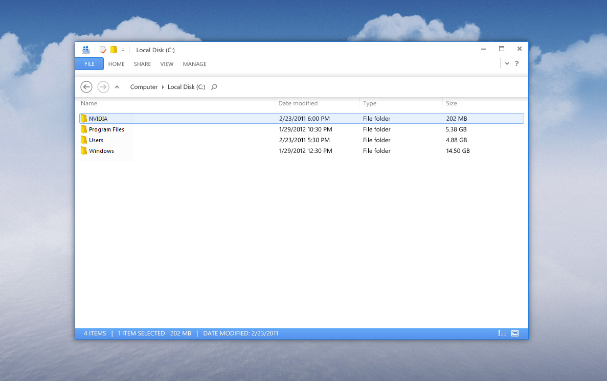
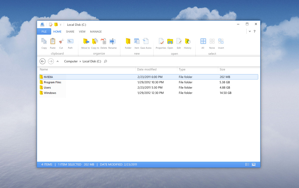


I count eight distinct types of system font in there, all denoting different data/functionality. Semiotically there are no signifiers other than the size, weight and position of the text. It's the closest thing you can get to mystery meat navigation whilst still providing words.
Look at current incarnations of Windows Explorer that people are familiar with. There is a very clearly delineated sidebar and "address bar" at the top. (The web changed the way that people interact with computers. Many people's first and only experience with computer applications is a web browser, and unfortunately for many of them it will have been Internet Explorer.)
By removing the lines of demarkation between UI elements, instead of downgrading the system interface it's been upgraded. Everything in the Windows Explorer pane is on equal footing.
The out of focus windows would get old pretty quickly too. If you're working on two things side by side your eyes have to switch between one in-focus and one out-of-focus window. Unless there's a way to dynamically switch focus to "on" for multiple windows, but then that would get messy quite quickly when you can't tell whether something is in the background or foreground, active or inactive. Yuck.
The dock at the bottom looks nice, but the challenge is that you're reliant on icon designers adhering to very specific standards or the whole thing will look crazy.